


![图片[1]-【折腾美化】网站页面的左右两侧代码添加梅花飘落特效-轻刻年轮](https://www.ly522.com/wp-content/uploads/2018/09/1941-600x600.png)
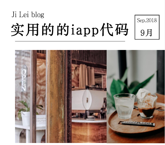
正好快要下班,然后就水一篇,这篇水分有点大哈,给网站左右两侧添加梅花飘落特效。博客适用哈,挺好玩的呢
效果图
![图片[2]-【折腾美化】网站页面的左右两侧代码添加梅花飘落特效-轻刻年轮](https://www.ly522.com/wp-content/uploads/2018/09/67cd146dgy1frxr-800x481.gif)
开始食用
首先,在body中,添加一个div,来放置梅花树枝的图片
<div id="meihua"></div>
然后,添加梅花树枝图片的css,在样式表里添加以下代码:其中url是梅花树枝地址替换成你自己的地址
#meihua {
background: url("images/meihua.png") no-repeat scroll 0% 0% transparent;
width: 278px;
height: 155px;
rightright: 0px;
top: 0px;
position: fixed;
z-index: 1;
}
以上,就能看到梅花树枝的图片了,具体大小和位置可以自己调整。
引用JS,在文章末尾已经给出完整的代码提供下载!
<script type="text/javascript" src="leaves.js"></script>
最后,再添加下梅花飘落的美化css。如下。
.leave {
position: fixed;
width: 25px;
height: 20px;
-webkit-animation-iteration-count: infinite,infinite;
-webkit-animation-direction: normal,normal;
-webkit-animation-timing-function: linear,ease-in;
-moz-animation-iteration-count: infinite,infinite;
-moz-animation-direction: normal,normal;
-moz-animation-timing-function: linear,ease-in;
-o-animation-iteration-count: infinite,infinite;
-o-animation-direction: normal,normal;
-o-animation-timing-function: linear,ease-in;
animation-iteration-count: infinite,infinite;
animation-direction: normal,normal;
animation-timing-function: linear,ease-in;
}
.leave>img {
position: fixed;
top:125px;
width: 25px;
height: 20px;
-webkit-animation-iteration-count: infinite;
-webkit-animation-direction: alternate;
-webkit-animation-timing-function: ease-in-out;
-webkit-transform-origin: 50% -100%;
-moz-animation-iteration-count: infinite;
-moz-animation-direction: alternate;
-moz-animation-timing-function: ease-in-out;
-moz-transform-origin: 50% -100%;
-o-animation-iteration-count: infinite;
-o-animation-direction: alternate;
-o-animation-timing-function: ease-in-out;
-o-transform-origin: 50% -100%;
animation-iteration-count: infinite;
animation-direction: alternate;
animation-timing-function: ease-in-out;
transform-origin: 50% -100%;
}
@-webkit-keyframes fade {
0% {
opacity: 1
}
95% {
opacity: 1
}
100% {
opacity: 0
}
}
@-webkit-keyframes drop {
0% {
-webkit-transform: translate(30px,-50px)
}
100% {
-webkit-transform: translate(-200px,650px)
}
}
@-webkit-keyframes clockwiseSpin {
0% {
-webkit-transform: rotate(-50deg)
}
100% {
-webkit-transform: rotate(50deg)
}
}
@-webkit-keyframes counterclockwiseSpinAndFlip {
0% {
-webkit-transform: scale(-1,1) rotate(50deg)
}
100% {
-webkit-transform: scale(-1,1) rotate(-50deg)
}
}
@-moz-keyframes fade {
0% {
opacity: 1
}
95% {
opacity: 1
}
100% {
opacity: 0
}
}
@-moz-keyframes drop {
0% {
-moz-transform: translate(30px,-50px)
}
100% {
-moz-transform: translate(-200px,650px)
}
}
@-moz-keyframes clockwiseSpin {
0% {
-moz-transform: rotate(-50deg)
}
100% {
-moz-transform: rotate(50deg)
}
}
@-moz-keyframes counterclockwiseSpinAndFlip {
0% {
-moz-transform: scale(-1,1) rotate(50deg)
}
100% {
-moz-transform: scale(-1,1) rotate(-50deg)
}
}
@-o-keyframes fade {
0% {
opacity: 1
}
95% {
opacity: 1
}
100% {
opacity: 0
}
}
@-o-keyframes drop {
0% {
-o-transform: translate(30px,-50px)
}
100% {
-o-transform: translate(-200px,650px)
}
}
@-o-keyframes clockwiseSpin {
0% {
-o-transform: rotate(-50deg)
}
100% {
-o-transform: rotate(50deg)
}
}
@-o-keyframes counterclockwiseSpinAndFlip {
0% {
-o-transform: scale(-1,1) rotate(50deg)
}
100% {
-o-transform: scale(-1,1) rotate(-50deg)
}
}
@keyframes fade {
0% {
opacity: 1
}
95% {
opacity: 1
}
100% {
opacity: 0
}
}
@keyframes drop {
0% {
transform: translate(30px,-50px)
}
100% {
transform: translate(-200px,650px)
}
}
@keyframes clockwiseSpin {
0% {
transform: rotate(-50deg)
}
100% {
transform: rotate(50deg)
}
}
@keyframes counterclockwiseSpinAndFlip {
0% {
transform: scale(-1,1) rotate(50deg)
}
100% {
transform: scale(-1,1) rotate(-50deg)
}
}
© 版权声明
THE END


![表情[qiang]-轻刻年轮](https://www.ly522.com/wp-content/themes/zibll/img/smilies/qiang.gif)
![表情[qiaoda]-轻刻年轮](https://www.ly522.com/wp-content/themes/zibll/img/smilies/qiaoda.gif) 666
666
- 最新
- 最热
只看作者